

Thermal imaging is a powerful technology that reveals heat patterns invisible to the naked eye, enabling professionals across many industries to detect issues, improve safety, and make informed decisions. However, the way thermal data is visually presented through a thermal palette can dramatically affect how easily and accurately you interpret these images.
What is a Thermal Palette?
A thermal palette is a colour scheme applied to thermal images that visually translates temperature data into colours or shades, making it easier to distinguish hot and cold areas at a glance. Each pixel in a thermal image represents a specific temperature, and the palette assigns a particular colour or shade to each temperature value. This allows users to quickly identify patterns, anomalies, or objects based on their heat signature, even when those differences are too subtle for the naked eye to detect.
How Thermal Palettes Work
Different thermal palette maps temperature data to colours or shades on a per-pixel basis. Like any digital image, thermal images are made up of pixels. The number of pixels in a thermal image is determined by the camera’s resolution. In thermal imaging, each individual pixel represents a specific temperature data point, these data points are assigned a unique colour or shade based on their value, meaning that as the thermal sensor detects changes in heat energy, it will express this change by adjusting the colour or shade of a pixel.
Types of Thermal Palettes and Their Uses
Usually the brighter colours red, orange, and yellow indicate warmer temperatures due to heat and infrared radiation being emitted. Whilst the purples, dark blues and black indicate cooler temperatures due to less heat and infrared radiation being emitted. The different colour tones correspond to the apparent surface temperatures of the target. The key is to select the palette that best shows the thermal differences for your specific application.
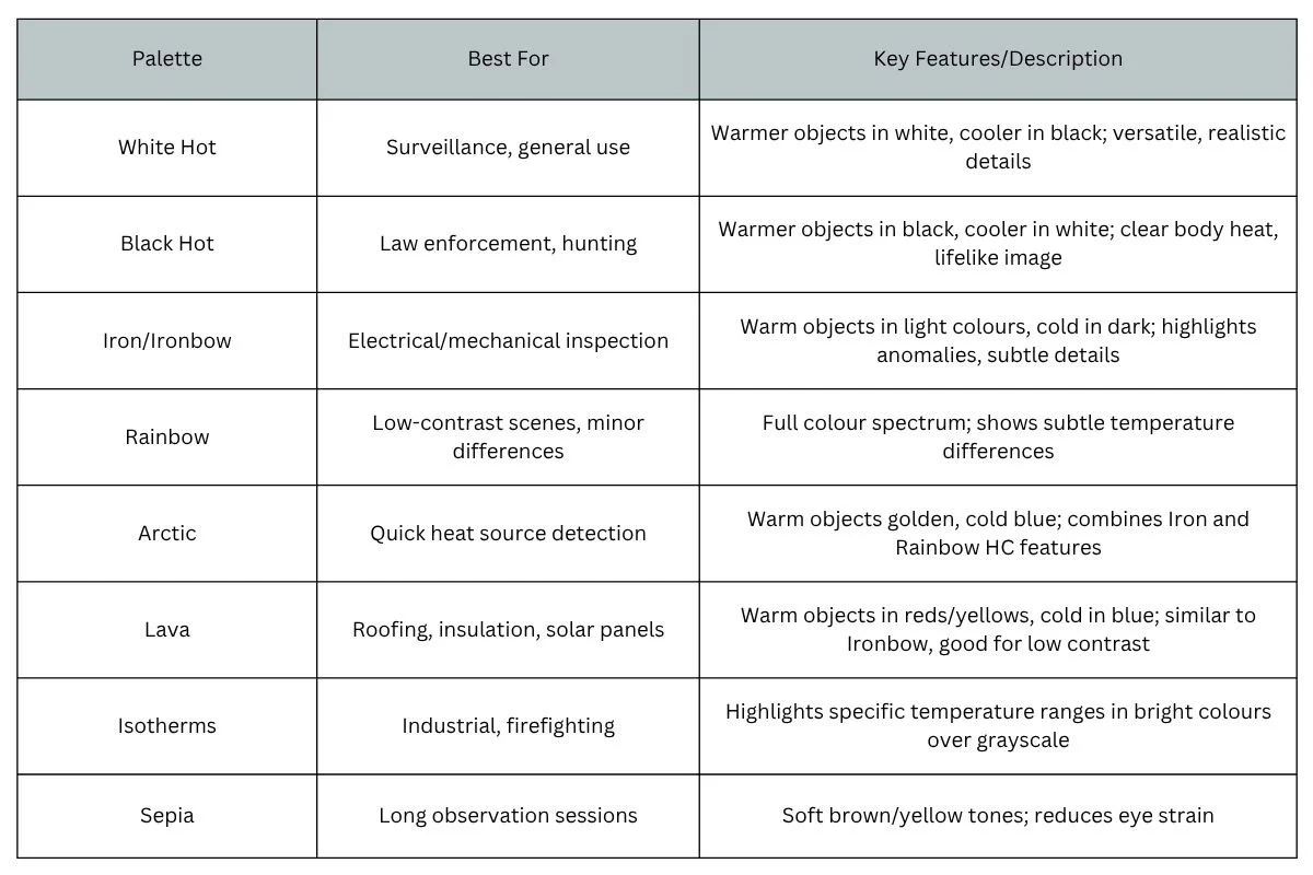
Thermal Palette Comparison Table
Grayscale Palettes
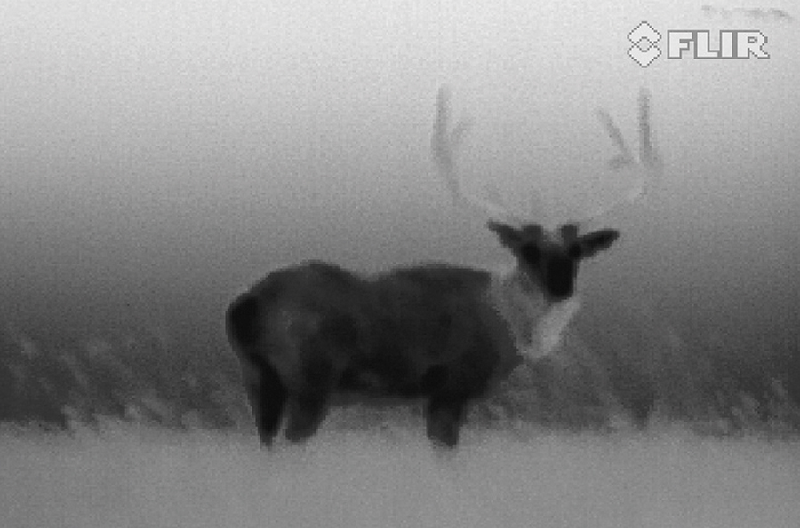
White Hot

White Hot Palette for Surveillance
The most commonly used palette, white hot displays warmer objects and cooler objects in black. Gray-scale palettes offer simplicity for scenes with a wide temperature span and generate images with realistic details. The versatility of white hot makes it appealing for use in shifting landscapes and urban areas and is often used to monitor and for surveillance.
Black Hot
Black Hot Palette for law enforcement
Black hot is the inverted version of hot white, displaying warmer objects as black and cooler objects as white. A favourite among law enforcement and hunters, black hot displays body heat in clear, lifelike image.
Sepia
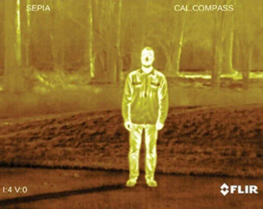
Sepia offers a softer alternative to traditional grayscale by using brown and yellow tones. This palette is designed to reduce eye strain during long observation periods, making it ideal for surveillance or extended inspection work.
High-Contrast Colour Palettes
Rainbow
Rainbow Palette for Building Survey
Using different colours to display temperature differences, Rainbow HC is best suited for scenes with minimal heat change. Focusing on an area with similar heat energy allows the Rainbow HC to detect objects and slight temperature changes despite low contrast conditions and is often applied whilst carrying out a building survey.
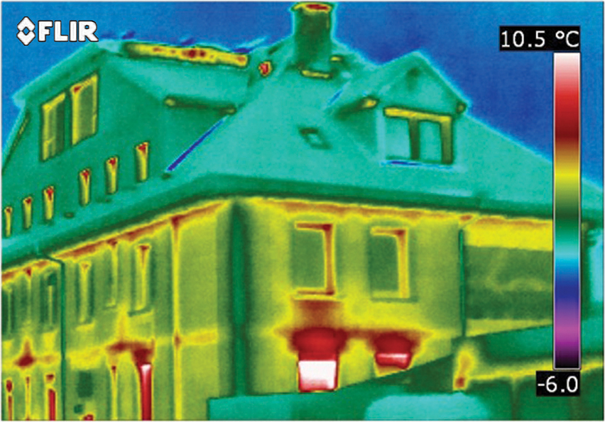
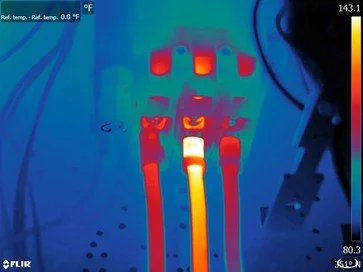
Iron/ Ironbow
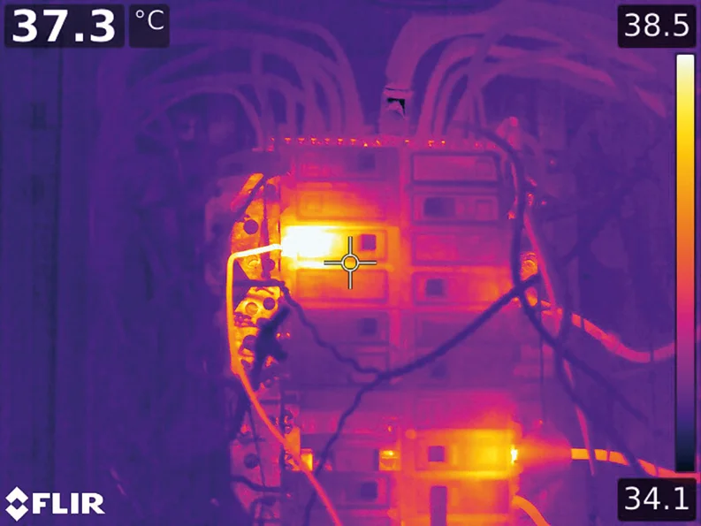
Iron Palette used in Electrical Surveys
A general-purpose palette that quickly identifies thermal anomalies and body heat, iron uses colour to show heat distribution and subtle details. Hot objects are shown in light warm colours, while colder objects are dark, cool colours. This palette is used by professionals carrying out electrical or mechanical inspections. Ironbow is a variant that features a smooth gradient from dark shades for cooler areas to bright yellows and whites for the hottest spots. It’s widely used in industrial and maintenance settings because it reveals subtle temperature variations and helps highlight thermal anomalies.
Lava
The Lava palette displays cooler regions in deep blues and purples, transitioning to bright oranges and yellows for hotter zones. Its bold contrast makes it a strong choice for applications like roof inspections, insulation checks, and solar panel analysis where quick identification of heat patterns is needed.
Artic

Atrtic Palette for Building Surveys
Used for identifying warm objects with a golden colour and colder objects with shades of blue the artic palette mixes the simple colouring or Iron with the low contrast performance of Rainbow HC. Differing colours quickly detect heat sources while darker shading picks out slight temperature changes.
Specialised and Alert Palettes
Isotherms
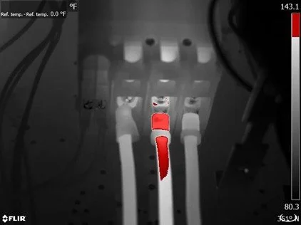
Isotherms allow users to highlight specific temperature bands within a thermal image by overlaying bright colours on those ranges. This targeted approach is ideal for industrial inspections and firefighting, where quickly identifying areas above or below critical temperature thresholds is essential.
Need Help with Thermal Palette Choice?
Selecting the right thermal palette is essential to accurately interpreting thermal images and help you make confident decisions . When you choose our thermal imaging services, our experts will work closely with you to identify the optimal palette for your specific applications and ensure your inspections deliver reliable, actionable results. We’re here to help you get the most from your thermal imaging technology and ensure your projects succeed, for more help please don’t hesitate to reach out